Portfolio : ActiveCanvas Portfolio
The Stewardship Foundation, Inc. : Branding Project
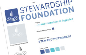
The Stewardship Foundation needed a new logo. The original logo had an integrated tagline that was impossible to decipher and a fanciful heart shape that suggested a question instead of a solution. With logo redesigns we usually try to salvage some part of the original design so that it can be recognized by current customers. In this case however, our solution was to start from scratch.
The foundation wanted to use the concept of “transformational giving” with some depiction of the miracle at Cana where water was transformed into wine. The problem of using water into wine was immediately apparent — what color is wine? (a purple red) and what color is water? (aqua blue). The color palette was problematic, as was communicating the concept so that it could be instantly recognized and understood in relationship to giving.
Our final solution was an oversized drop of liquid (that could be water or wine) and the ripple effect of the drop into liquid. Since ripples are traditionally associated with giving there would be no doubt in the viewers mind as to the nature of the organization.
The rectangular shape of the logo conforms nicely with the top real estate of a webpage, suggests financial soundness , and nicely accommodates the two long words that make up the organizational name. The tagline “transformational giving” completes the iconic look, and the drop/ripple icon is perfect for background images on marketing materials, presentations, and other collateral.
Other work we’ve done for The Stewardship Foundation, Inc.
View Other Branding Projects
- « Abundant Energy, Inc.
- « Advisors in Philanthropy
- « Apple Tree Health Plans LLC
- « Cadeau
- « Cairn Law
- « Community of the Good Shepherd
- « DL MoneyMatters
- « Glory Association
- « Holman Consulting, Inc.
- « JBK Ventures LLC
- « Kate Cartwright Art
- « Legacy Planning Associates
- « Philanthropic Planning Group of Greater New York
- « The Stewardship Foundation, Inc.
- « Today & Tomorrow Strategies
View Other Work Categories
- « Branding
- « Internet Marketing